
stake Design system

I partnered with investment broker Stake to develop a design system that established UI consistency and reusable components. This streamlined internal design processes and communication, enabling the Stake team to deliver more consistent products for their 750,000 users.
Year
2022
Client
Stake
Lenght
3 weeks
THE WHAT
THE WHY
THE HOW
For this project I’ve been tasked to create a design system including: style guide, UI components, photography, iconography, typography colours, icons and guiding princples for HelloStake investing platform.
At the time of making, Stake was a fast growing platform that allows its users to invest in the stock market via their app available on both mobile and desktop. As the platform was growing and competing with other investment brokers like Hatch, Sharesies or Tiger investing in Australia, the company was rapidly evolving it’s UI and kept rolling out new functions. With the growing number of assets came growing need for for a design system giving designers and developers guideline and framework to build making changes and improvements to its digital products.
As there already have been publicly available resources, the direction for this project was quickly set by opening Developer Tools in my browser and analysing each individual element, to either replicated it or give it a form and correctly documenting it. In terms of organisation, I have compared different design systems open to public to get ideas of which structure will be the suitable for this particular piece of work.
Introduction
Stake is an online trading platform that connects Wall Street with investors from Australia and New Zealand. What sets Stake apart from other trading platform is the clean minimalistic user interface, mobile aplication and in-depth financial analysis.
Outside of the mobile application, Stake has other content channels (web platform, marketing page hellostake.com/nz and social media). The marketing page is linked to the Stake web platform and in most cases serves as an entry point for users visiting the web platform behind the paywall. The purpose of the marketing page is an advertisement of Stake trading services, overview of pricing plans, blog, careers page, technical support and login (paywall).
Because investors’ money is important, Stake offers a clean modern look that enables maximum user experience on both web based platform and mobile application. Keeping the platform’s interface transparent with easy access adds confidence to new and experienced investors, who can track their trades and market movements in real-time.
In this design system I will guide you through the landing / marketing page and the web platform. Viewports in some sections will also include sizing for a mobile application. Stake offers standard trading services and basic analysis with a standard free account or additional premium analysis and data as a part of Stake Black paid membership. In this design system the two memberships won’t be differentiated.
Guiding Principles
Stake understands the user’s perspective. With clear virtual language, Stake is transparent and accesible to all users. In the world of trading there is very little to no room for uncertainty, which is the reason why Stake offers an easy access and modern, minimalistic interface that makes trading easy for everyone.
Transparency: White, black, red and green are colours that make clear statement. Stake aims to make a clear statement in digital world and promote it on its platforms. It should take only a fragment of a second to know what is happening with users’ investments and what their reaction should be. Stake clearly distinguishes good from bad and makes it easy to understand for all its customers.
Cleanlines: Stake designs a clean experience for its users who’s focus is aimed primarily on the subject of learning about the world of trading and learning how to complete trades. The most important goal for the development team is to eliminate all disruptions by delivering clean and elegant system.
Simplicity: Stake’s UI is minimalistic and purposeful. Each component, line and piece of information has a purpose that helps its users to make the right decisions. Appropriate information architechture and spacing are some of the most important attributes contributing to the simplicity of Stake website.
Marketing: Primarily done through the marketing page and social media. Content as articles and updates on stock market movements are being shared to wider audience without having to sign up. New content, updates and advertising is shared on Instagram, Facebook and Twitter
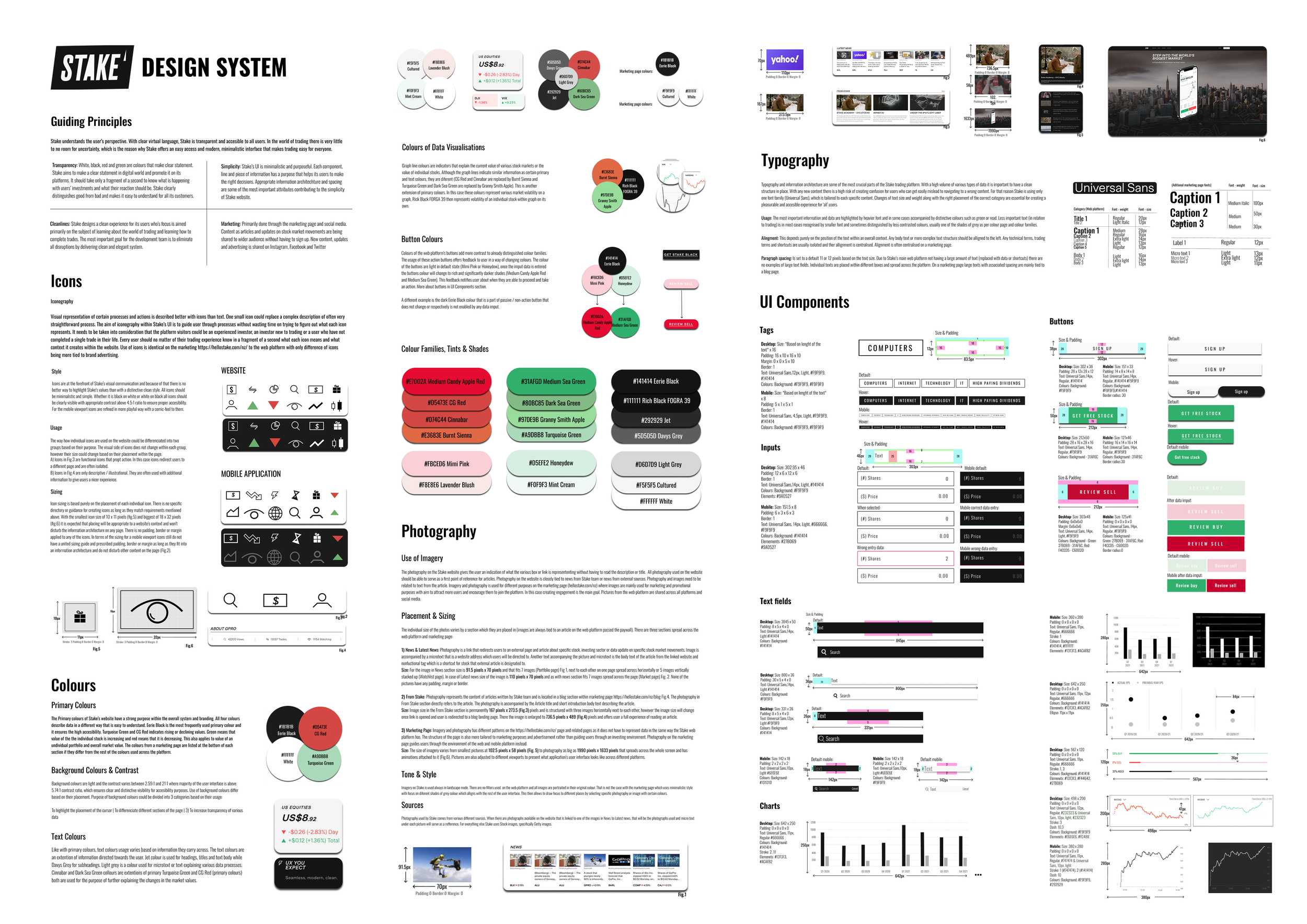
Iconography
Iconography Visual representation of certain processes and actions is described better with icons than text. One small icon could replace a complex description of often very straightforward process. The aim of iconography within Stake’s UI is to guide user through processes without wasting time on trying to figure out what each icon represents. It needs to be taken into consideration that the platform visitors could be an experienced investor, an investor new to trading or a user who have not completed a single trade in their life. Every user should no matter of their trading experience know in a fragment of a second what each icon means and what context it creates within the website. Use of icons is identical on the marketing https://hellostake.com/nz/ to the web platform with only difference of icons being more tied to brand advertising.
STYLE
Icons are at the forefront of Stake’s visual communication and because of that there is no better way to highlight Stake’s values than with a distinctive clean style. All icons should be minimalistic and simple. Whether it is black on white or white on black all icons should be clearly visible with appropriate contrast above 4.5:1 ratio to ensure proper accesibility. For the mobile viewport icons are refined in more playful way with a comic-feel to them.
USAGE
The way how individual icons are used on the website could be differenciated into two groups based on their purpose. The visual side of icons does not change within each group, however their size could change based on their placement within the page. A) Icons in Fig.3 are functional icons that propt action. In this case icons redirect users to a different page and are often isolated. B) Icons in Fig.4 are only descriptive / illustrational. They are often used with additional information to give users a nicer experience.
sizing
Icon sizing is based purely on the placement of each individual icon. There is no specific directory or guidence for creating icons as long as they match requirements mentioned above. With the smallest icon size of 10 x 11 pixels (fig.5) and biggest of 18 x 32 pixels (fig.6) it is expected that placing will be appropriate to a website’s context and won’t disturb the information architecture on any page. There is no padding, border or margin applied to any of the icons. In terms of the sizing for a mobile viewport icons still do not have a united sizing guide and prescribed padding, border or margin as long as they fit into an information architecture and do not disturb other content on the page (Fig.2).


DESKTOP


MOBILE

Colours
Primary colours

The Primary colours of Stake’s website have a strong purpose within the overall system and branding. All four colours describe data in a different way that is easy to understand. Eerie Black is the most frequently used primary colour and it ensures the high accesibility. Turquoise Green and CG Red indicates rising or declining values. Green means that value of the the individual stock is increasing and red means that it is decreasing. This also applies to value of an undividual portfolio and overall market value. The colours from a marketing page are listed at the bottom of each section if they differ from the rest of the colours used across the platform.
Background colour & contrast
Background colours are light and the contrast varies between 2.59:1 and 21:1 where majority of the user interface is above 5.74:1 contrast ratio, which ensures clear and distinctive visibility for accesibility purposes. Use of background colours differ based on their placement. Purpose of background colours could be divided into 3 categories based on their usage: 1) To highlight the placement of the cursor 2) To differenciate different sections of the page 3) To increase transparency of various data
text colour
Like with primary colours, text colours usage varies based on information they carry across. The text colours are an extention of information directed towards the user. Jet colour is used for headings, titles and text body while Davys Grey for subheadings. Light grey is a colour used for microtext or text explaining various data processes. Cinnabar and Dark Sea Green collours are extentions of primary Turquoise Green and CG Red (primary colours) both are used for the purpose of further explaining the changes in the market values.

COLOUR OF DATA VISUALISATION
Graph line colours are indicators that explain the current value of various stock markets or the value of individual stocks. Although the graph lines indicate similar information as certain primary and text colours, they are diferent (CG Red and Cinnabar are replaced by Burnt Sienna and Turquoise Green and Dark Sea Green are replaced by Granny Smith Apple). This is another extension of primary colours. In this case these colours represent various market volatility on a graph, Rick Black FORGA 39 then represents volatility of an individual stock within graph on its own.


Buttons
Colours of the web platform’s buttons add more contrast to already distinguished colour families. The usage of these action buttons offers feedback to user in a way of changing colours. The colour of the buttons are light in default state (Mimi Pink or Honeydow), once the imput data is entered the buttons colour will change to rich and significantly darker shades (Medium Candy Apple Red and Medium Sea Green). This feedback notifies user about when they are able to proceed and take an action. More about buttons in UI Components section. A different example is the dark Eerie Black colour that is a part of passive / non-action button that does not change or respectively is not enabled by any data imput.

Colour families, Tints and Shades

ui components

tags
Desktop:
Size: *Based on lenght of the text* x 16
Padding: 16 x 10 x 16 x 10
Margin: 0 x 0 x 5 x 10
Border: 1
Text: Universal Sans,12px, Light, #F9F9F9, #141414
Colours: Background: #F9F9F9, #F9F9F9
Mobile:
Size: *Based on lenght of the text* x 8
Padding: 5 x 1 x 5 x 1
Border: 1
Text: Universal Sans, 4.5px, Light, #F9F9F9, #141414
Colours: Background: #F9F9F9, #F9F9F9

Input data
Desktop:
Size: 302.95 x 46 Padding: 12 x 6 x 12 x 6 Border: 1 Text: Universal Sans,14px, Light, #141414 Colours: Background: #F9F9F9 Elements: #9A0527
Mobile:
Size: 151.5 x 8 Padding: 6 x 3 x 6 x 3 Border: 1 Text: Universal Sans, 14px, Light, #666666, #F9F9F9 Colours: Background: #141414 Elemements: #27B069 #9A0527

buttons
Desktop:
Size: 302 x 38 Padding: 28 x 12x 28 x 12 Text: Universal Sans,14px, Regular, #141414 Colours: Background: #F9F9F9
Mobile:
Mobile: Size; 151 x 33 Padding: 14 x 8 x 14 x 8 Text: Universal Sans,14px, Regular, #141414 #F9F9F9 Colours: Background: #F9F9F9,#141414 Border radius: 30
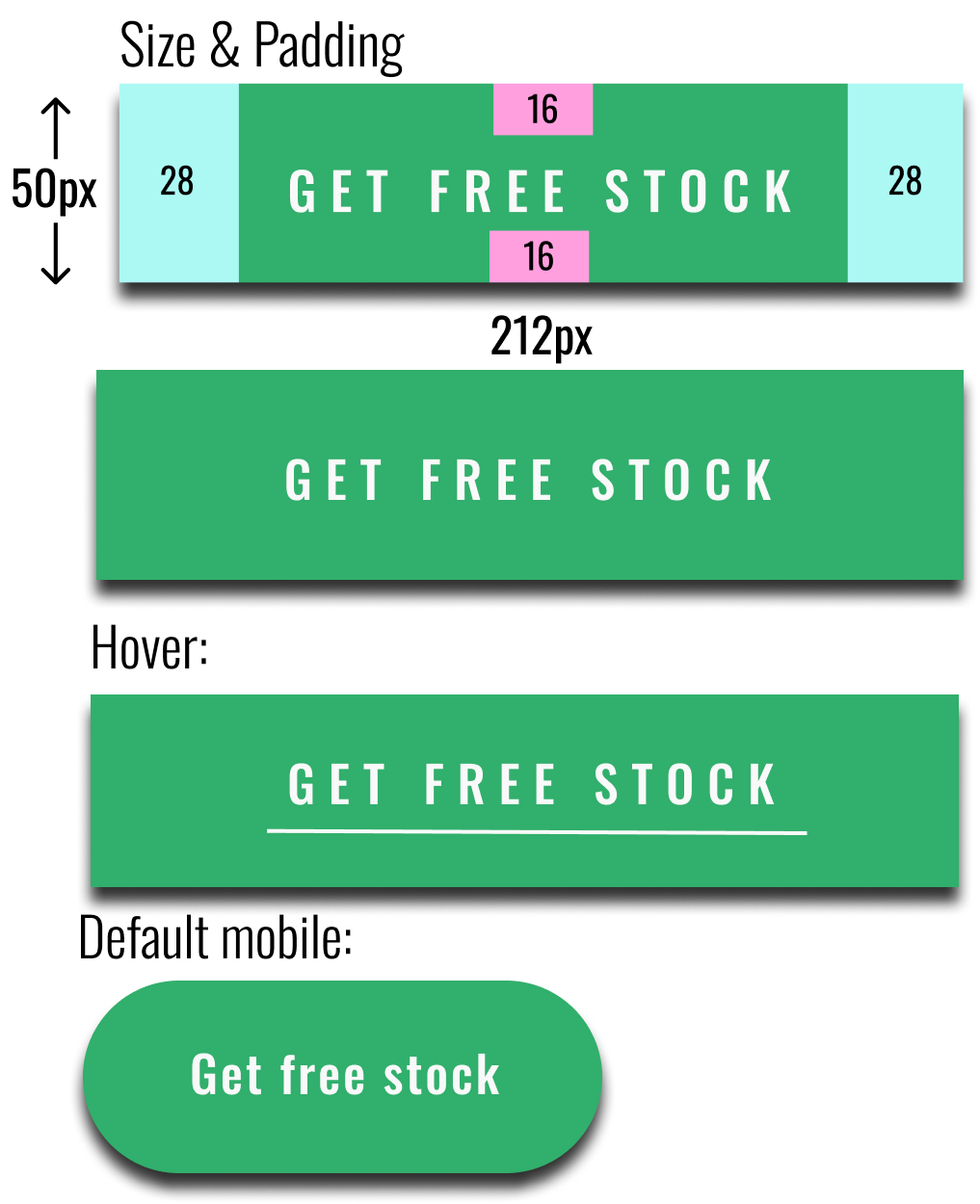
Desktop:
Size: 212x50
Padding: 28 x 16 x 28 x 16
Text: Universal Sans, 14px, Regular, #F9F9F9
Colours: Background - 31AF6C
Mobile:
Size; 151 x 33
Padding: 14 x 8 x 14 x 8
Text: Universal Sans,14px, Regular, #141414 #F9F9F9
Colours: Background: #F9F9F9,#141414
Border radius: 30

Desktop:
Size: 303x48
Padding: 6x0x6x0
Margin: 0x6x0x6
Text: Universal Sans, 14px, Light, #F9F9F9
Colours: Background - Green: 27B069 - 31AF6C, Red: F4CCD5 - C6002D
Mobile:
Size: 125x41
Padding: 0 x 0 x 0 x 0
Text: Universal Sans, 14px, Regular, #F9F9F9
Colours: Background :
Green: 27B069 - 31AF6C, Red: F4CCD5 - C6002D
Border radius:0
Typography
Typography and information architecture are some of the most crucial parts of the Stake trading platform. With a high volume of various types of data it is important to have a clean structure in place. With any new content there is a high risk of creating confusion for users who can get easily mislead to navigating to a wrong content. For that reason Stake is using only one font family (Universal Sans), which is tailored to each specific content. Changes of text size and weight along with the right placement of the correct category are essential for creating a pleasurable and accesible experience for ‘all’ users.
Usage
Usage: The most important information and data are highlighted by heavier font and in some cases accompanied by distinctive colours such as green or read. Less important text (in relation to trading) is in most cases recognised by smaller font and sometimes distinguished by less contrasted colours, usually one of the shades of grey as per colour page and colour families.

Allingnment
Alingment: This depends purely on the position of the text within an overall context. Any body text or more complex text structure should be alligned to the left. Any technical terms, trading terms and shortcuts are usually isolated and ther allignment is centralised. Alignment is often centralised on a marketing page.
Usage
Paragraph spacing: Is set to a default 11 or 12 pixels based on the text size. Due to Stake’s main web platform not having a large amount of text (replaced with data or shortcuts) there are no examples of large text fields. Individual texts are placed within different boxes and spread across the platform. On a marketing page large texts with associated spacing are mainly tied to a blog page.
language
writing goals
With ‘all’ content Stake publish and produce, the creator is aiming to:
Educate - Help people to understand the world of finance. Explain changes that are occuring within an investment world and deliver relevant data that is very accurate and easy to comprehend. Keeping platform users updated on how Stake operates in New Zealand and Australia and changes that are occuring within an investment world.
Call for action - Encourage investors to learn the most recent updates and changes that might have an impact on their current or future investments.
Respect - Treat all users with respect. When writing content we need to understand that not all website visitors are skilled investors who are fluent in investing dictionaries. It is important to be as objective as possible to never influence users investing decisions in any way.
Help - Offer help or guidence whenever it is needed but keep previous parragraph in mind.
Voice
Stake uses a formal tone as it is an organisation that is sharing in-depth expertise. Stake acknowledges that its users would not appreciate plain language and unprofessional communication when their investments are at the centre of the business model.Voice and tone should be a mirror of professionality, expertise and values. To ensure this, everyone needs to follow language & style guide to stay consistent, professional and distribute our ideas in the best possible manner at all times.
Example:
Avoid ---> You should have a look at renewable energy ETF here.. ---> Please see link below for information about Reneweable energy ETF.
Neutrality - Platform is neutral and Stake aims to always remain neutral. that should be emphasised through the published text. Independency is the key factor in the context within trading platform.
Example:
Avoid ---> We suggest you to double-check. Consider ---> We encourage all investors to make their own analysis
Grammar - Grammar should be alwaysat the centre of all conentent writing. Grammar has an extra importance for trading platforms like Stake because if it is done correctly it does suggest that the content is professional and trustworthy. No matter how trendy and fun some text could be, always check the grammar
There is a high importance of leaving space between important data outputs (mainly numbers and shortcuts).
The reason for this is to ensure that data is clearly visible, easy to read and that it does not merge together with different unrelated data. Although the website is primarily built on a box system, spacing between different data sets gives a website table-like looking system. This, with clean and minimalistic interface adds elegancy to the final product.
Colours outside of black and white should only be used for volatile data that register constant changes based on the market movements. This ensures clear separation between stable (static) data and constantly changing data. For more information on colour please refer to the ‘Colours Section’.
Overall style of the page should be always clean and easy to read. Different sections should be clearly visible and it should be easy to navigate between them for users. Stake should be offering new information and encourage investors / traders to educate themselves to broaden their general knowledge. This should be only encouraged and never pushed upon someone.
Being genuine - Stake is genuine and always offer up to date and the best to our knowledge advice if someone reach out for one. Although keep in mind that Stake is not a financial consultancy but trading platform.
Spirit of openness - Stake encourages everyone involved to be always open about processes and changes. If there are any concerns that users could be affected in any way, update with description should be shared with users as soon as it is possible to do so. It is important to analyse the level of risk and extend to which users could be affected. Offer alternative solution if there is one available.
Example:
Avoid ---> Web is under maintanance ---> Unfortunatly we had to make a change on our website which now requires little time off. We’ll sent you an email update as soon as we are back up and running. We apologise for an inconvenience. Try out our mobile in a meantime!
General content writing suggestions
Be Brief - When anyone within organisation writes content, it needs to be as brief as possible to make the user understand the point within a few seconds.
Be Specific - Write to the point and avoid using confusing words. It is important that possible confusion or misunderstandings are avoided.
Write short - A few simple sentences that are easy to understand and are straight to the point are more effective than unnecessary time-consuming essays.
style guide
imagery
use of imagery

Principles
In order to achieve goals mentioned above, Stake makes sure the content is:
Easy to understand - Use of simple words and short sentences that will make it easy for new investors to join the investment platform. It should only take a couple of seconds to get to understand the context of the website and each individual piece of information. Make all users (new to investing and experienced investors) understand the content related to investing and finance.
Keep everyone updated - It should be clear from any new published content what changes occured in users account and in their investment portfolio. Keep in mind the impact any information could have on users life, no matter if they invest in tens of dollars or tens of thousands of dollars.
Staying openminded - It is important to respect everyone and promote diversity through our content. Our website should take no stands and be accessible and open to everyone. As mentioned in “01 Writing goals” objectivity is the key.
Clarity - To ensure that Stake effectively helps investors, its team needs to make sure that all content is clear, clean and information comes from legitimated and verified sources. Always check the source and make sure that you don’t spread any misinformation or fake news.
Tone & grammar


The individual size of the photos varies by a section which they are placed in (images are always tied to an article on the web platform passed the paywall). There are three sections spread across the web platform and marketing page:
1) News & Latest News: Photography is a link that redirects users to an external page and article about specific stock, investing sector or data update on specific stock market movements. Image is accompanied by a microtext that is a website address which users will be directed to. Another text accompanying the picture and microtext is the body text of the article from the linked website and nonfuctional tag which is a shortcut for stock that external article is designated to.
Size: For the image in News section size is 91.5 pixels x 70 pixels and that fits 7 images (Portfolio page) Fig 1, next to each other on one page spread across horizontally or 5 images vertically stacked up (Watchlist page). In case of Latest news size of the image is 110 pixels x 70 pixels and as with news section fits 7 images spread across the page (Market page) Fig. 2. None of the pictures have any padding, margin or border.
From Stake: Photography represents the content of articles written by Stake team and is located in a blog section within marketing page https://hellostake.com/nz/blog Fig.4. The photography in From Stake section directly refers to the article. The photography is accompanied by the Article title and short introduction body text describing the article.
Size: Image size in the From Stake section is permanently 167 pixels x 273.5 (Fig.3) pixels and is structured with three images horizontally next to each other, however the image size will change once link is opened and user is redirected to a blog landing page. There the image is enlarged to 736.5 pixels x 489 (Fig.4) pixels and offers user a full experience of reading an article.
Marketing Page: Imagery and photography has different patterns on the https://hellostake.com/nz/ page and related pages as it does not have to represent data in the same way the Stake web platform has. The structure of the page is also more tailored to marketing purposes and advertisement rather than guiding users through an investing environment. Photography on the marketing page guides users through the environment of the web and mobile platform instead.
Size: The size of imagery varies from smallest pictures at 102.5 pixels x 58 pixels (Fig. 5) to photography as big as 1990 pixels x 1633 pixels that spreads across the whole screen and has animations attached to it (Fig.6). Pictures are also adjusted to different viewports to present what application’s user interface looks like across different platforms.
tone and style
Imagery on Stake is used always in landscape mode. There are no filters used on the web platform and all images are portraited in their original colour. That is not the case with the marketing page which uses minimalistic style with focus on diferent shades of grey colour which alligns with the rest of the user interface. This then allows to draw focus to different places by selecting specific photography or image with certain colours.
Sources
Photography used by Stake comes from various different sources. When there are photographs available on the website that is linked to one of the images in News to Latest news, that will be the photographs used and micro text under each picture will serve as a refference. For everything else Stake uses Stock images, specifically Getty images.
The photography on the Stake website gives the user an indication of what the various box or link is represententing without having to read the description or title. All photography used on the website should be able to serve as a first point of reference for articles. Photography on the website is closely tied to news from Stake team or news from external sources. Photography and images need to be related to text from the article. Imagery and photography is used for different purposes on the marketing page (hellostake.com/nz) where images are mainly used for marketing and promotional purposes with aim to attract more users and encourage them to join the platform. In this case creating engagement is the main goal. Pictures from the web platform are shared across all platforms and social media.