
IIN - Web redesign

For the Impact Investing Network (INN), New Zealand's only non-profit organization of its kind, our team redesigned their web interface to better support their mission of contributing to a sustainable, equitable, and prosperous Aotearoa through investment education.
Client
Impact Investing Network
Deliverables
Hi-fi prototype, New Website
Year
2021
My role
UX/UI Design / Product design
The What
The why
The how
My team of 3 (two designers and front-end developer) was asked to:
Improve information architecture and establish a robust design system
Optimise navigation to enhance user experience and content accessibility
Refine visual design to strengthen brand alignment
Drive increased website traffic
Boost newsletter sign-ups
The Discovery
Research

user interviews
Through qualitative research with five participants, we explored user needs, pain points, and user flows related to the Impact Investing Network website. Participants were recruited from current website users, primarily investors and individuals working with the organization.

From user feedback it was identified that the current website was outdated and not fit for purpose anymore
Our goal was to analyse current website and build our project around user needs and expectations. We knew that thorough audit will be required to understand how the website works we also knew that it likely that we’ll need to build a new design system to speed up the development process at the moment and in the future. And yes, we had to talk to users.
Analysis of the original website
Our analysis of the existing website identified several key user experience problems the most important ones were tied to:
Confusing content hierarchy
Inconsistent UI elements and navigation flows
Poor information clarity and discoverability

Content audit
To evaluate the IIN website's content and its consistency with brand identity, we conducted a comprehensive content audit. Key findings revealed the following challenges:
The taxonomy used on the member resources page was unclear, making it difficult for users to navigate and find relevant information.
The structural hierarchy of the Board Members and Team pages lacked a clear structure, resulting in a disorganized presentation of information.
Content accessibility was limited due to the absence of a direct search function on the main page, hindering users' ability to find specific articles.
DSignificant content overlap existed between the "resources" and "articles" sections, leading to potential user confusion.
CARD SORTING
This research method enabled us to analyze how users categorize information, directly informing our design decisions for the final concept and providing a strong understanding of the existing information architecture. We conducted this research with five participants using Miro and OptimalWorkshop.

The development
CONCEPTING PHASE
Our ideation phase ran parallel to our user research interviews and content audit. While we were uncovering some aspects of user experiences and website flaws, we were creating ideas and structures based on our assumptions. Due to the time constraints, we had to implement multiple steps ahead at the same time.
Our process allowed us to refine ideas we already had, using our research as a guide for our redesign.

SITEMAP DEVELOPMENT
The revised user flow outlines the complete website experience, prioritizing user access to information, newsletter subscriptions, and engagement with IIN's social media channels.

REVISED USER-FLOW
Based on user research and iterative design, we created a redesigned sitemap that optimizes information architecture by defining clear page purposes and enhancing navigation.


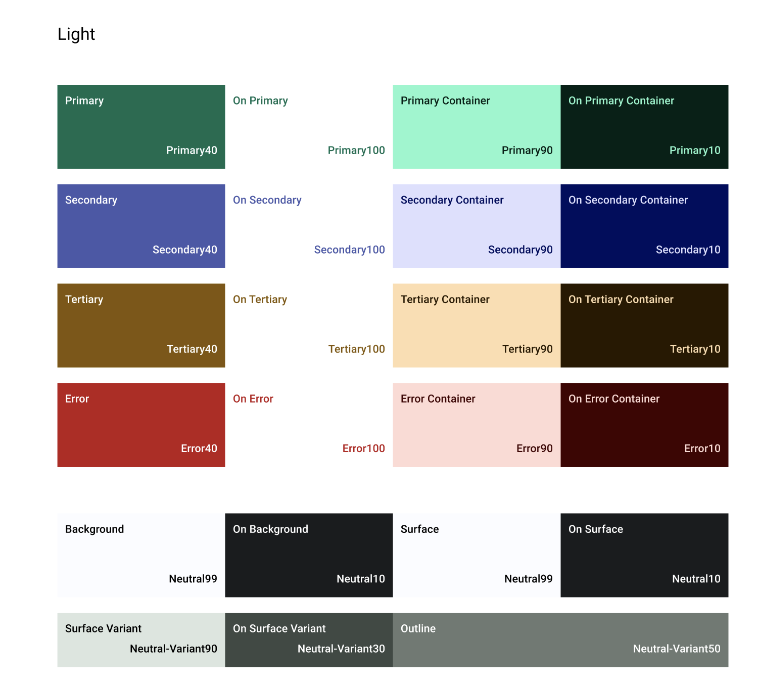
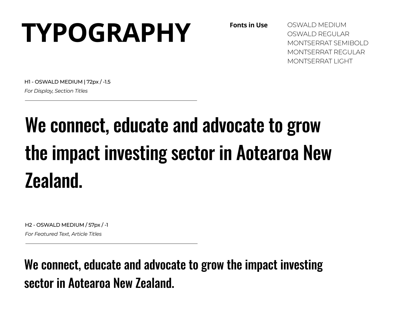
A new design system and style guide were developed to maintain consistent brand representation and clear communication across all interactions with the Impact Investing Network's volunteers, employees, collaborators, and users.
DESIGN SYSTEM &
STYLE GUIDE
Final product
CONCEPTING PHASE
The redesigned website, optimiSed for both desktop and mobile, provides an enhanced user experience through improved navigation, a dedicated news and events portal, simplified learning resources for new and aspiring investors, and streamlined contact options.Our process allowed us to refine ideas we already had, using our research as a guide for our redesign.


REFLECTION
LEARNINGS
By creating systems and documenting your processes well, you can save a significant amount of time in the future.
Same applies to testing. Test, test, test and test well.
Lo-fi sketching is as important as development of high-fidelity concepts.
LEARNINGS


Offer help – by becoming available and offering help with future changes, we can evaluate our steps, processes and choices.
User testing – to identify areas of further improvement